In a recent bulletin, I argued that public‐sector unions impose various costs and burdens on state and local governments. Here is some more evidence.
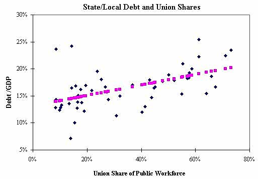
The chart below shows a scatter plot of the union shares in state/local government workforces and state/local government debt levels as a share of state gross domestic product. Each blue dot is a U.S. state.
The variables are correlated — as the union share increases, a state tends to have a higher government debt load. The chart shows the fitted regression line in pink dots (R‑square=0.27; F‑stat=18; t‑stat on the union share variable=4.2).
The correlation is likely caused by the fact that unionized government workers are powerful lobby groups that push for higher government‐worker compensation and higher government spending in general.
(Thanks to Amy Mandler for data help and Andrew Biggs for suggestions. Andrew’s work on state debt is here).